Ageing and Marathon Running
Running is great. One of the worst parts, though, is other people telling you how it’s all downhill after 30. But is it? It’s a persistent idea, so I wanted to see if actual marathon results support it. To get an idea of how age affects running performance, we’ll use the data from the Berlin Marathon, after some cleaning up, focussing on the year 2016.
tl;dr The performance of the average 20 year old is comparable to that of the average 50 year old. The 34 year old men were the fastest on average for their sex, whereas the 31 year old women were fastest on average for their sex.
Let’s load the data.
# mapping table from country abbreviations to country names
mapping <- read_csv('data/country_continent_mapping.csv') %>%
  transmute(
    country = name,
    alpha3 = `alpha-3`
  )

# read all the data: 2005 to 2016
df0 <- read_csv('data/berlin_marathon_times.csv') %>%
  transmute(
    year,
    age,
    sex = ordered(sex, levels = c('W', 'M')),
    usex = factor(sex, levels = c('W', 'M'), ordered = FALSE), # for technical reasons
    alpha3 = nationality, # for joining with mapping table
    net_time = as.duration(hms(net_time)),
    hours = as.numeric(net_time, 'hours')
  ) %>%
  inner_join(mapping, by = 'alpha3') %>%
  mutate(country = factor(country)) %>%
  arrange(hours) %>%
  drop_na()

# year of interest
df <- df0 %>%
  filter(year == 2016)

# sample of data
df %>%
  head() %>%
  select(-usex, -alpha3, -hours) %>%
  kable() %>%
kable_styling(bootstrap_options = c("striped", "hover", "responsive"))| year | age | sex | net_time | country |
|---|---|---|---|---|
| 2016 | 34 | M | 7383s (~2.05 hours) | Ethiopia |
| 2016 | 34 | M | 7393s (~2.05 hours) | Kenya |
| 2016 | 28 | M | 7531s (~2.09 hours) | Kenya |
| 2016 | 26 | M | 7616s (~2.12 hours) | Ethiopia |
| 2016 | 27 | M | 7667s (~2.13 hours) | Kenya |
| 2016 | 34 | M | 7769s (~2.16 hours) | Kenya |
We have the variables age, sex, nationality, and net_time for a cross section of marathon runners to play with. To measure the effect of age on running performance, we should really be looking at multiple measurements of the same runners at different ages, whilst controlling for features more directly related to running performance (e.g. vO2max, training volume). This would be a fairly expensive experiment and I didn’t find any research in that direction (if you find some, please let me know). We’ll do what we can with the data at hand but the results can only be suggestive of interesting questions to pursue.
A first look
The average finishing time amongst the runners is about 4 hours 12 minutes, and the average age around 42. These numbers are fairly constant over the years.
df0 %>%
  group_by(year) %>%
  summarise(
    mean_hours = mean(hours),
    mean_age = mean(age)
  ) %>%
  gather(metric, value, mean_hours, mean_age) %>%
  ggplot(aes(x = year, y = value)) +
  geom_col() +
  scale_x_discrete(limits = seq(2005, 2016, 2)) +
  facet_wrap(~ metric, scales = 'free_y') +
  labs(
    x = 'Year',
    y = 'Value',
    title = 'Average age and finishing time per year',
    subtitle = 'Berlin Marathon'
  ) +
  NULL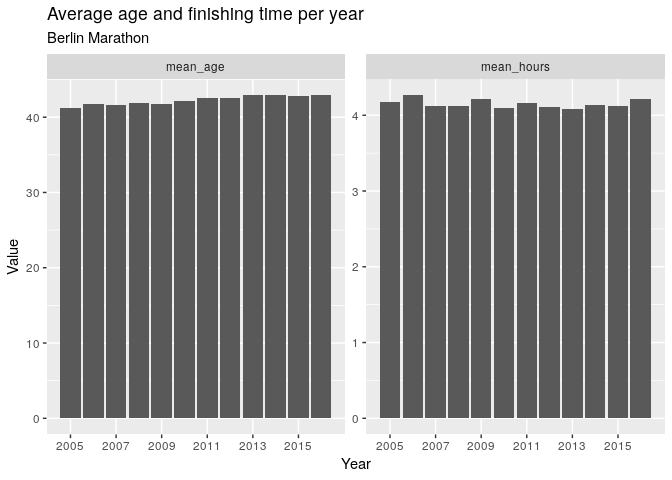
The results are similar when broken down by sex.
df0 %>%
  group_by(year, sex) %>%
  summarise(
    mean_hours = mean(hours),
    mean_age = mean(age)
  ) %>%
  gather(metric, value, mean_hours, mean_age) %>%
  ggplot(aes(x = year, y = value, fill = sex)) +
  geom_col() +
  scale_x_discrete(limits = seq(2005, 2016, 2)) +
  facet_grid(metric ~ sex, scales = 'free_y') +
  labs(
    x = 'Year',
    y = 'Value',
    title = 'Average age and finishing time per year per sex',
    subtitle = 'Berlin Marathon'
  ) +
  NULL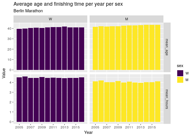
Age and Sex
Below is a scatter plot of finishing time against age. The first noticable property is that there is a LOT of variation. Indeed, it would be highly suprising if we could explain running performance with just age, with factors such as vvO2max and lactate threshold being much more relevant. For some scale of reference, a sub-3h marathon is a challenging goal for many amateur marathon runners - a goal achieved by some in their 60s in this dataset.
df %>%
  ggplot(aes(x = age, y = hours)) +
  geom_point(alpha = 0.03) +
  geom_smooth(se = FALSE) +
  scale_y_continuous(breaks = seq(2, 8, by = 1)) +
  scale_x_continuous(breaks = seq(20, 80, by = 5)) +
  labs(
    y = 'Net finishing time (hours)',
    x = 'Age',
    title = 'Finishing time vs. Age',
    subtitle = 'Berlin Marathon 2016'
) 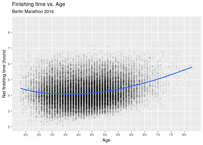
Next up is the trend line, which shows that the runners in their early 20s were actually a bit slower than those in their late 20s. The trend then stays fairly flat until the early 40s, when the trend starts to slow down.
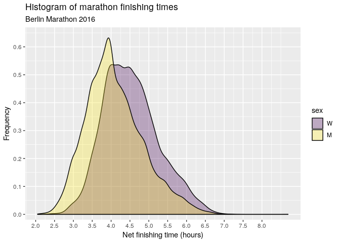
The above chart lumps men and women together, but the following histogram suggests a difference between the sexes.
df %>%
  ggplot(aes(hours, fill = sex)) +
  geom_density(alpha = 0.3) +
  scale_x_continuous(breaks = seq(2, 8, by = 0.5)) +
  scale_y_continuous(limits = c(0, 0.65), breaks = seq(0, 0.6, by = 0.1), expand = c(0, 0.02)) +
  labs(
    x = 'Net finishing time (hours)',
    y = 'Frequency',
    title = 'Histogram of marathon finishing times',
    subtitle = 'Berlin Marathon 2016'
  )
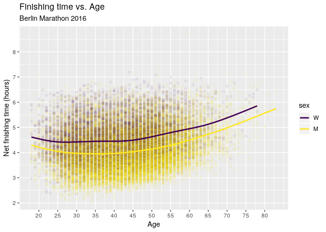
Breaking down the hours-age chart by sex tells a similar story. The main difference is that the trend for women flattens out a bit earlier at around age 25 compared to around age 30 for men.
df %>%
  ggplot(aes(x = age, y = hours, colour = sex)) +
  geom_point(alpha = 0.05) +
  geom_smooth(se = FALSE) +
  scale_y_continuous(breaks = seq(2, 8, by = 1)) +
  scale_x_continuous(breaks = seq(20, 80, by = 5)) +
  labs(
    y = 'Net finishing time (hours)',
    x = 'Age',
    title = 'Finishing time vs. Age',
    subtitle = 'Berlin Marathon 2016'
) 
Nationality
It is also possible that nationality plays some role here. The Berlin marathon is an international event with big prize money at stake and it draws the best of the best from around the world. International travel is also costly and it seems plausible that this could have some influence on the statistical properties of the runners.
ranking_m1 <- df %>%
  group_by(country) %>%
  summarise(
    mean_hours = mean(hours),
    mean_age = mean(age),
    runners = n()
  ) %>%
  arrange(mean_hours)

head(ranking_m1) %>%
  kable() %>%
kable_styling(bootstrap_options = c("striped", "hover", "responsive"))| country | mean_hours | mean_age | runners |
|---|---|---|---|
| Lesotho | 2.451111 | 36.00000 | 1 |
| Eritrea | 2.657500 | 28.25000 | 4 |
| Ethiopia | 2.749514 | 28.33333 | 12 |
| Kenya | 2.963480 | 34.94737 | 19 |
| Kazakhstan | 3.002222 | 27.00000 | 1 |
| Guinea | 3.130556 | 26.00000 | 1 |
However, a breakdown of the 118 countries has the problem that the number of participants for many countries is very small. Small sample sizes lead to high-variance estimates. In other words, we don’t necessarily believe that the average Berlin marathon runner from Lesotho is faster than the average Berlin marathon runner from Kenya on the basis of just one runner. We need some way of using all the information available so that low sample size groups don’t have such extreme estimates. In the next section, we will use random effects to account for this.
Models
This section gets a bit technical; feel free to skip to the end for the pretty charts.
The trend for age doesn’t look linear - it has a U-shape. We could try to model this by adding the quadratic term age^2 into our linear models. However, in general we don’t know how many powers we will need to sufficiently model the effect and the effect may not even be polynomial. Instead, we harness the power of general additive models, a.k.a GAMs. Indeed, the trend lines in our plots above actually used GAMs behind the scenes. The advantage of using GAMs is that you don’t have to mess around trying to add the right number of powers into your linear models, or even assume the the trend is polynomial at all.
The s() notation indicates that we want to fit an arbitrary smooth function to the data (not just a linear function). A smooth has a number of optional parameters; here bs = re uses random effects as our basis, and by = sex indicates a different age-smooth for each sex.
m <- gam(
  hours ~ 1 + s(country, bs = 're') + usex + s(age) + s(age, by = sex),
  family = Gamma(),
  data = df,
  method = "REML"
)

summary(m)
Family: Gamma
Link function: inverse
Formula:
hours ~ 1 + s(country, bs = "re") + usex + s(age) + s(age, by = sex)
Parametric coefficients:
Estimate Std. Error t value Pr(>|t|)
(Intercept) 0.221962 0.002341 94.81 <2e-16 ***
usexM 0.024254 0.000469 51.72 <2e-16 ***
---
Signif. codes: 0 '***' 0.001 '**' 0.01 '*' 0.05 '.' 0.1 ' ' 1
Approximate significance of smooth terms:
edf Ref.df F p-value
s(country) 83.294 117.000 23.306 < 2e-16 ***
s(age) 6.004 6.959 64.706 < 2e-16 ***
s(age):sexM 3.931 4.817 4.439 0.00105 **
---
Signif. codes: 0 '***' 0.001 '**' 0.01 '*' 0.05 '.' 0.1 ' ' 1
R-sq.(adj) = 0.179 Deviance explained = 17.9%
-REML = 37846 Scale est. = 0.028131 n = 35986This model achieves an explained deviance of 17.9% (analogous to R^2 for Gaußian models). This is low, as expected, but it is unlikely we can get anything much higher from this dataset.
The observations in the dataset are to some degree not independent since many runners run in packs. This is especially the case for those runners following the official pacers. It is not clear how we could account for this or to what extent it affects the estimates. My guess is that it wouldn’t change them too much.
The residual QQ plot seems acceptable.
qq.gam(m)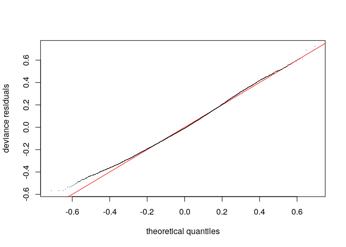
The country-level effects are modelled as Gaußian and the QQ plot indicates a decent fit, with the execption of a handful of countries on the extremes. Perhaps a non-normal distribution would model the random effects better, but we’ll roll with this for now.
Note that there are about 83 degrees of freedom although we have included estimates of all 118 countries. This is a direct consequence of using random effects.
plot(m, select = 1)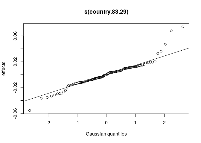
An interesting byproduct of using random effects to model country level variance is that we can then rank countries by their effect. Since country has an additive effect and the link function is exp, the effect of country on hours is multiplicative. Here we show the multiplicative effect of country on net finishing time. Note that Lesotho is no longer on top despite having the highest raw average time. Indeed, this country effect is higher for those countries with both faster times and more runners.
df %>%
  distinct(country, .keep_all = TRUE) %>%
  cbind(
    predict(m, newdata = ., type = 'terms') %>%
      as_tibble() %>%
      transmute(country_effect = exp(`s(country)`))
  ) %>%
  inner_join(ranking_m1, by = 'country') %>%
  select(country, country_effect, runners, mean_hours) %>%
  arrange(desc(country_effect)) %>%
  head() %>%
  kable() %>%
kable_styling(bootstrap_options = c('hover', 'striped', 'responsive'))| country | country_effect | runners | mean_hours |
|---|---|---|---|
| Ethiopia | 1.076819 | 12 | 2.749514 |
| Kenya | 1.070141 | 19 | 2.963480 |
| Eritrea | 1.048144 | 4 | 2.657500 |
| Algeria | 1.036830 | 6 | 3.276991 |
| Lithuania | 1.033381 | 32 | 3.552552 |
| Norway | 1.021137 | 589 | 3.834238 |
Feel free to explore more model diagnostics or find a better fitting model.
Results
Let’s create a grid of values of interest and get the fitted estimates from our model.
add_fit <- function(df, model) {
  # add columns for model's predicted response and se
  df %>%
    cbind(predict(model, newdata = ., type = 'response', se.fit = TRUE))
}

# grid of values of interest
mygrid <- as_tibble(
    expand.grid(
      age = 15:80,
      sex = c('W', 'M'),
      country = 'Germany'
    )
  ) %>%
  mutate(usex = sex) %>%
  add_fit(m)
We have used Germany as our reference country for a couple of reasons:
- the mgcv package makes it difficult to exclude random effects from response prediction;
- every country has the same curves up to a multiplicative constant; and
- Germany has the highest number of participants.
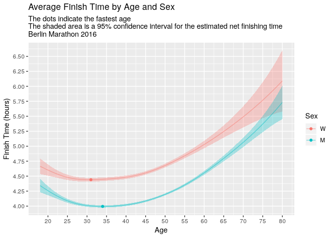
Ideally we would set the country effect to zero here, but will proceed regardless. Below is the point estimate with 95% confidence intervals.
mygrid %>%
  ggplot(aes(x = age, y = fit, colour = sex)) +
  geom_ribbon(aes(ymin = fit - 2 * se.fit, ymax = fit + 2 * se.fit, fill = sex), show.legend = FALSE, colour = NA, alpha = 0.3) +
  geom_line(alpha = 0.5) +
  geom_point(data = mygrid %>% group_by(sex) %>% slice(which.min(fit))) +
  scale_x_continuous(breaks = seq(20, 80, 5), limits = c(18, 80)) +
  scale_y_continuous(breaks = seq(4, 7, 0.25)) +
  labs(
    title = 'Average Finish Time by Age and Sex',
    subtitle = 'The dots indicate the fastest age\nThe shaded area is a 95% confidence interval for the estimated net finishing time\nBerlin Marathon 2016',
    x = 'Age',
    y = 'Finish Time (hours)',
    colour = 'Sex'
  )
The 31 years old women are the fastest age group, whereas for men it’s around 34. Moreover, the performance of the 20 year olds is comparable to that of the ~50 year olds.
So far we have only considered the year 2016. We can apply the same analysis to every year since 2005.
mymodel <- function(df) {
  # fit the desired model to the data
  gam(
    hours ~ 1 + s(country, bs = 're') + usex + s(age) + s(age, by = sex),
    family = Gamma(),
    data = df,
    method = "REML"
  )
}

# apply the model to each year separately
all_years_modelled <- df0 %>%
  nest(-year) %>%
  mutate(
    model = map(data, mymodel),
    pred = map(model, function(x) {
                        add_fit(mygrid, x)
                      }
    )
  ) %>%
  unnest(pred)
This time we drop the confidence intervals and get a feel for the uncertainty by plotting a line for every year.
all_years_modelled %>%
  ggplot(aes(x = age, y = fit, colour = year, group = year)) +
  geom_line(alpha = 0.3) +
  geom_point(data = all_years_modelled %>% group_by(year, sex) %>% slice(which.min(fit)), alpha = 0.7) +
  facet_wrap(~ sex) +
  scale_x_continuous(breaks = seq(20, 80, 5), limits = c(18, 80)) +
  scale_y_continuous(breaks = seq(4, 6, 0.25)) +
  labs(
    title = 'Average Finish Time by Age and Sex',
    subtitle = 'Each line is an estimate for different year: 2005 -- 2016\nThe dots indicate the fastest age',
    x = 'Age',
    y = 'Finish Time (hours)',
    colour = 'Year'
  )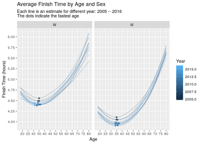
Notice that the fastest ages approximately increase with year, most notably for women. We can display this relationship better by simply plotting estimated fastest age against year.
all_years_modelled %>%
  group_by(year, sex) %>%
  slice(which.min(fit)) %>%
  ggplot(aes(x = year, y = age, colour = sex)) +
  geom_point() +
  scale_y_continuous(breaks = seq(30, 40, 1)) +
  scale_x_continuous(breaks = seq(2005, 2015, 2)) +
  facet_wrap(~ sex) +
  geom_smooth(method = lm) +
  labs(
    x = 'Year',
    y = 'Age',
    colour = 'Sex',
    title = 'Fastest age per year',
    subtitle = 'Berlin Marathon'
  )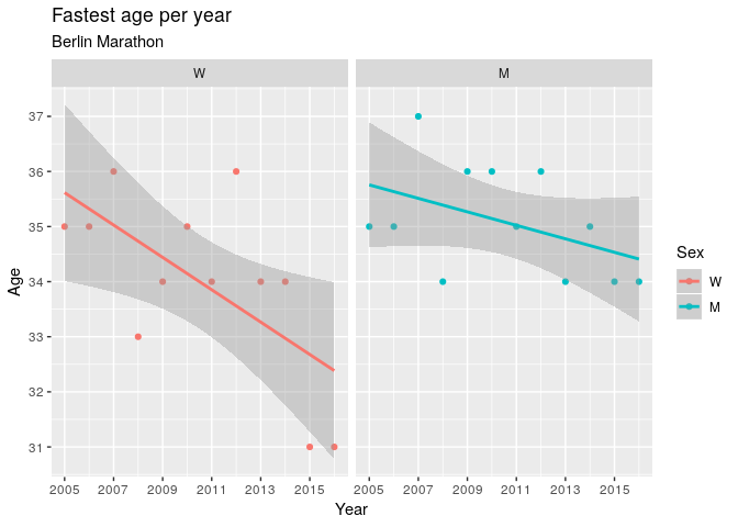
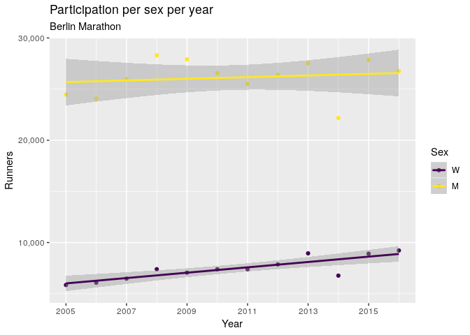
It will be interesting to see if the fastest age for women stays low in future years. It is possible that this change in fastest age for women is due to increasing participation. Indeed, participation is increasing faster for women than for men, although it starts from a much smaller number.
df0 %>%
  group_by(year, sex) %>%
  summarise(total = n()) %>%
  arrange(sex, year) %>%
  ggplot(aes(x = year, y = total, colour = sex)) +
  geom_point() +
  geom_smooth(method = lm) +
  scale_y_continuous(labels = scales::comma) +
  scale_x_continuous(breaks = seq(2005, 2015, 2)) +
  labs(
    x = 'Year',
    y = 'Runners',
    colour = 'Sex',
    title = 'Participation per sex per year',
    subtitle = 'Berlin Marathon'
  )
Conclusion
On the basis of our dataset, there is no indication that performance declines at 30. Indeed, those in their early 30s tend to be the fastest age group, both for men and women. Moreover, the performance of the 20 year olds is comparable to that of the ~50 year olds, perhaps suggesting that running performance doesn’t degrade as fast as people often think it does.